If ever you see a button with three dots in the top of a table or Insight in Welbi, it means you have more view options available to you. When you see this button in the top-right corner of an Insight, you have the option switch between viewing the Insight as a pie chart (which shows data in terms of percentages) or a bar chart (which shows data in terms of counts).
To toggle between pie and bar charts, simply click on the button and select "Pie" or "Bar" from the "Chart" drop-down menu that appears.
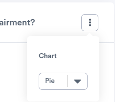
You should now see the Insight displayed in the format you selected. When you hover over the different sections of your chart, you'll be able to see the value.
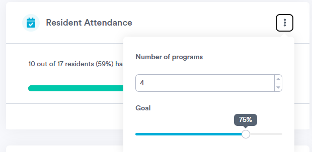
Note: An exception to the above is the "Resident Attendance" Insight (located under the Programs tab). For this Insight, the button allows you to set up a target or goal for resident attendance. For example, the screenshot below shows a user setting an attendance goal of 4 programs, which they'd like to see met by 75% of their resident population.